0 comments

Final Animation Links

This project was unique not just because it was a live project or it was my first website design, but because the hand in required a GIF file, something i personally never made before, and was surprised how simple it was to display.
I'm very pleased with the final animation, i believe some resolution was lost when uploading but i'm still happy it shows the detail of all the features.
The active cursor showing functionality and the device boarder in my opinion really brought the whole animation together for those final touches.

The Final Animation Link:         https://vimeo.com/102370924

read more
0 comments

Editing and Complications

Editing was a long slow process with many mistakes, mainly software and file type issues.
I started editing the animation in after effects but since it was primarily a stop motion of digital assets, after effects wasn't suited to my projects needs, this was due to problems with importing all folders in order and in the right hierarchy, animating the smiley tools in separate layers, and being unable to animate the cursor image without the layer either being invisible or blanking out the rest of the screen.

In the end i decided this project was better suited to be animated in flash. Importing and arranging the screens was the first step, however the timing constantly needed edited once i started animating the smileys on a new layer.

I had to create separate photoshop files for the smileys and cursor so i could animate them, originally i was going to use the Jpeg files when i was animating in after effects however now i've decided to use flash, each smiley had to be separated into individual photoshop files with blank backgrounds and imported one by one.
I attempted to animate them using motion tweens but it was blurred for too long or not at all, once the motion tween idea didn't work i tried animating them keyframe by keyframe, however the airbrush highlights were different each time, giving the smiley animations a jumpy appearance, which was just unappealing, so i settled on animating them in the same style as the website screens.

The cursor on the other hand was unusual to animate, i used a motion tween however because it was dealing with alot of movements in the one tween on a small scale, the motion guide lines kept going way off or unnecessarily arching, causing a very unnatural movement for the cursor, this took alot of tweaking and positioning using the arrow keys rather than a mouse.

Once the animation was completed i saved it out as an avi and as a gif file.
In the tutors tutorial when making an app version of this website, he included a high resolution image of an iphone as a boarder, i liked this finishing touch that gave the whole project a more professional final outcome, so i decided to include a desktop version, i edited out the background and screen of the stock image i gathered online however when i brought it into flash to include it, the animation doesn't scroll down the screen, meaning the whole projects animation would have to be redone, at this point in the project the deadline was approaching so i decided it was too time consuming for its purpose, instead i used an ipad to show the tablet version of the website.

Unlike the desktop version i had alot of trouble including the ipad boarder, it required a different canvas size and re-positioning the whole animation. re-positioning the animation frame by frame would've was time consuming and unwise at this point of the project, so instead i used the avi file on a new flash document, however this had to be first converted into an flv file. I used the encoder to do so but it mustn't have converted the whole file, since out of an approx 30 second animation, i only had 7 seconds, the encoder wasn't working properly and it was very time consuming trying to fix it then looking for an alternative option, especially considering the large file size.
This was probably the most unanticipated and biggest problem i encountered during this entire live project.

When i finally converted the avi to flv and imported it into the stage, i was able to position the ipad boarder and save it out, ready to be uploaded online. Due to the amount of assets and the fact i used adobe software to animate and edit the prototype it was difficult to compress the file for uploading without loosing resolution or timing.
read more
0 comments

Digital, the making of

The digital assets took me alot longer than originally anticipated, but well worth it in the end.
I started the digital work with the main features and constant assets, as there was no room for error when it came to the final outcome of these assets.
I made the digital assets with the wireframes as guides.

The banner was the biggest feature and would set the tone for each page. I began with the background image, Although the first prototypes didn't have much detail, it was obvious the colour scheme and stye i was aiming for, at first i couldnt find the appropriate style of panoramic meadow view i was aiming for to edit and tweak, so i intended to create my own and add a filter, however whilst i was creating this i came across the perfect upbeat meadow stock image on a popular student website.
Although i needed to add a filter (low-brush stroke) and effect (sharpen) in the end it turned out upbeat and casual but not overly childish.
This was a decent start towards setting the tone and style for the website. I think the colourful and cutesy appearance is quite farmville like.

Next i worked on the title, like i discussed during feedback and the client presentation i wanted a notice board appearance with alphabet like type, especially on the banner assets. For this i researched many fonts on websites like Dafont.com but couldn't find the precise lettering i wanted, i brainstormed alternatives, such as creating my own type on available websites, like i did in typography in first year of my course, The type would've been basic, and then edited in photoshop for a 3D appearance. In the end i cut out the middle man and used a high resolution image of basic alphabet letter fridge magnets.
Letter by letter  i placed the magnets image, and erased excess letters whilst using the magic eraser tool for the white background this gave the final letter a cleaner finish. One the letter was finished and the title arranged it was only a matter of rotating the letters to give it that casual crooked style whilst leaving it legible and professional. This process was time consuming but i prefer the final appearance of the type images rather than a unique font that wouldn't have given it that more interactive style.

The emergency sign was far more difficult than id anticipated. Although it was a simple matter of creating a sign post like box with a wooden or plastic like gradient and adding a text box.
I took it a step further and designed a hanging sign post with cutesy details on sketchbook pro, suiting the websites tools and buttons more. I took the image into photoshop and deleted the white background from sketch book pro, however the type didn't transfer over properly, so i back tracked and transferred the sign post without the type then added the warning in using the usual text box, i rotated it in hopes it would give the text a more natural look, but this wasn't enough.
I tried using an ink outline filter with the dark intensity scale extremely low but i wasn't satisfied with how the type rested on the signpost. Normally i wouldn't have worried about such an extremely unnoticeable feature, but this was a major constant in the banner that would be visible throughout the final animation.
After a few different approaches including transforming, editing and several effects, i found the multiply feature with the opacity level altered gave the type a more natural appearance, showing the small features of planks and wooden details behind the type, as if it was painted on carefully.
Once i was happy with the type i experimented with the ink outline filter again and found it improved the final appearance of the sign posts style now that the type had a multiply effect, i think it really highlighted the warning sign whilst keeping the same style as the rest of the banner and website.
To set it apart from the meadow back ground i added a simple drop shadow to show distance.
In my opinion the final warnings sign post is at a happy medium where it stands out but isn't distracting from the rest of the website, leaving the feature perfect for its intended use.

When focusing on the banner and its assets, i worked my way downwards and prioritized the features details. Next was the wooden panel that would hold the main website navigation buttons. To a user this would likely be one of the most used assets of the banner so to me there was no room for error, especially with this asset.
So far id been following the wireframe guides but only as guides, once it came time to include the banner i noticed it just wasn't big or obvious enough for the intended use, so i adjusted the size appropriately, practically doubling it, allowing room for icon buttons and large enough type. This meant all the wireframe guides were pushed down lower, leaving the final canvas size longer.
At first i used a box tool with a wooden themed gradient, but it paled in comparison with the work id put into the rest of the banner, as its the lowest part of the banner before the user sees the rest of the website, i wanted it to make sure the user could differentiate it.
I added a drop shadow and added effect to highlight it but it wasn't enough, So i decided to use a stock image of a plank of wood, but once again i ran into the problem of nit having the prefect wooden plank, so using sketch book pro again i created my own version of a horizontal plank that suited the style and theme of the website, similar to the sign post but with a different type of wooden colours, leaving them equally highlighted on screen but not too similar to cause confusion for the user.
Once i added it, erased excess backgrounds and positioned it appropriately i noticed it didn't have that obviously interactive element.
So i experimented with filters and lighting effects, in the end i used a spotlight, with a high enough intensity to highlight the banner and give it a more realistic look, however i lowered it and widened the distance as to not loose the detail in the wood, unfortunately between the spotlight and the icons i added later, the majority of the detail was lost, but i'm still pleased with its final outcome.
Although the banner seemed perfect, it was still missing that element of hierarchy and dominance on the page, i didn't want it to interfere with the websites main purpose but i wanted the banner to be obviously separate from the lower panels and interactions, giving it a more dominant theme.
The drop shadow id experimented with earlier in the banner design gave it that extra definition, So i added a drop shadow effect, however it was too big and not obvious enough, so i tightened the spread and darkened the opacity and size, hopefully giving it that more dominant appearance but not interfering with the lower half of the websites features and panels or leaving it too distant and over bearing in comparison.

The last asset to design was the main navigation icons that hung on the wooden panel, i didn't want the website to be too tacky or flash website like so i avoided shape buttons with a simple colour or gradient and type. After some further designing and research i decided that the final paper designs suited the banner and intended theme and use perfectly.
I was unsure if the would be held up by blue tac, cellotape or a notice board pin, or perhaps nothing, so researched stock images, and found a style and shape i preferred, it was top corner paper pieces ripped on the right and bottom sides, this was held up by a pin, which suited the notice board theme, however the image itself didn't suit the cartoon style, so i used it as a reference image and basically rotoscoped it in photoshop, giving it the same drawing style as the other banner assets.
The type was simple and sized appropriately and positioned inside the paper pieces, i then merged these together so the type couldn't be altered if i were to moved the banner or the icons later.
Like the wooden plank i gave the paper buttons more dominance that matched their purpose by using a weak drop shadow, I think this simple effect gave the whole banner extra definition and made it obviously interactive compared to the rest.
The home button would be the only one used in the final animation to show functionality, for this i gave it an intense inner glow radiating from the edges.

Once the banner was completed i was unsatisfied with the titles final look compared to all the other assets, it wasn't overly eye catching, although it was cute and set the tone for the friendly website, it wasn't highlighted enough and i would suspect the clients wouldn't have been pleased with it, to fix this i added a strong but thin golden outer glow, giving it a memorable shiny appearance, like old school branding.

Working through the constant assets first  i created the next major features, which was the helping tool 'Smiley' I was extremely excited to create the smileys and smiley like title buttons for both Health and Social, they are one of the most unique features in my website design.
Using the reference images i presented on my mood board and the final Smiley sketches i posted previously, i created the smileys one by one using photoshop.
Normally i would use illustrator, which i began my smiley work, but found i constantly need to reference the wire frames, so i decided now was as good a time as any to begin illustrating in photoshop for the first time.
I started many times but struggled to get the right 3d like look for the digital versions of smiley, i wanted him cute and colourful like the rest of the website but i also wanted him calming and separated from any of the websites screens, allowing the user to have him obviously at hand and interactive.
I debated creating him in 3d studio max for a more professional outcome, but ultimately decided full 3d smileys would be out of place and not as approachable as a 3d like 2d version.
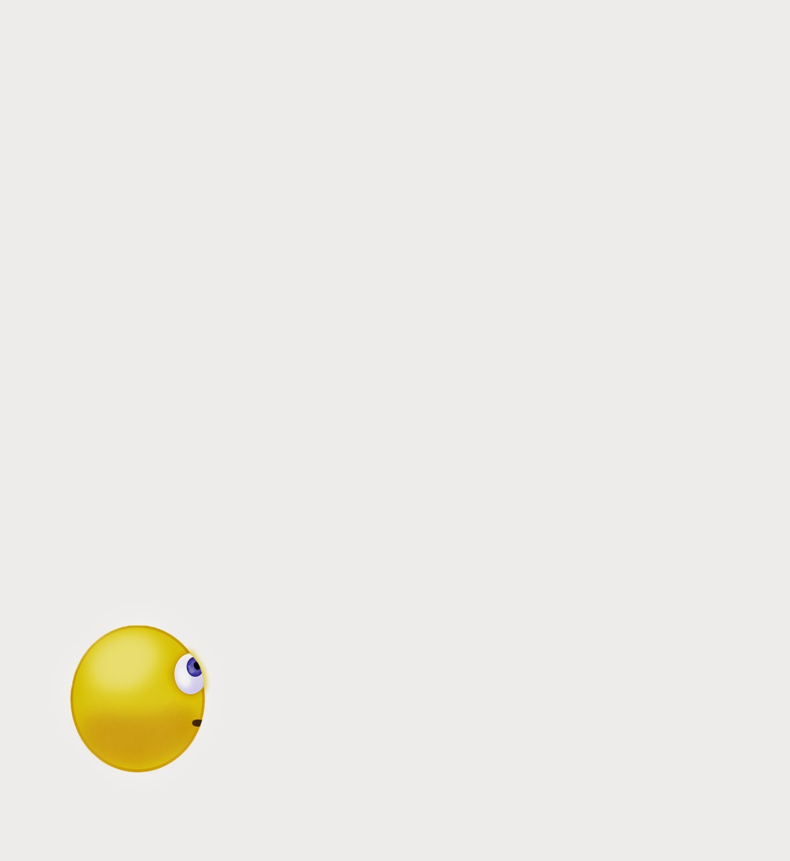
The Smileys used in the final animation were created by using the eclipse tool, with a thin but distinctive (2px) dark yellow outline, i attempted several different yellow gradients but in the end used a yellow fill. I used this background ball for each smiley, but layered each of them differently with further details.
I used the airbrush tool with a darker yellow for Smileys under belly and a light airbrushed white to highlight and define his 3d like curvature.
The eyes were difficult, i wanted them friendly and full of the relevant emotions.
Most of the smileys have the same eyes on slightly tweaked to show the different emotion or line of sight.
Basically most of them consist of an eclipse with the same dark yellow outline as the background eclipse and a faint light blue to white gradient, with small faint airbrushing to show gloss and curve details, the eclipse has a dark yellow drop shadow with a high curved contour. Above that there's another smaller eclipse with a dark blue outline and a light blue-blue radial gradient, with a very dark blue pupil and light blue 10px and 4px or 2px highlights, i originally wanted to airbrush these highlights like the background eclipse but it left the smileys eyes looking unnatural, faint and inconsistent with the cartoon like style of the rest of the website.
The mouths were extremely tricky to get right, especially the colour since black was too out of place yet yellow wasn't obvious enough, even with a drop shadow or darker outline, i'm not entirely pleased with the final yellow/brown colour but it seemed the most suitable in the end.
The smileys search and information boxes were created using a simple rounded box with a light blue gradient fill, however the accessories were made from the original designs except the thermometer in the Health icon smiley, it was an online jpeg that i added adjustments and a filter sponge filter to.
The book and its block colour was too simple so i added a light brown inner shadow to give it depth, and the bag of ice on the Health icon was given an adjusted plastic wrap filter to give it a more realistic texture, although i like the final look of the plastic bag with the filter, im certain most of the detailed ice inside the bag is lost through the filter.
Im extremely pleased with the final versions of Smiley and the smiley health and social icons.

neutral

hover

waiting

correction

search

snooze


The background for the two side panels ie health and social panels that act as the biggest filter in the website, are two large boxes with identical blue gradients, however this made the middle section where most of the functionality will be shown, looked bare, so i added a very faint pink fill that wouldn't interfere with any of the other assets or actions, i think the faint pink also compliments the dominant blue theme in the website. Although i would prefer a less generic colour for the panels, it is the most calming and suitable for the overall theme, i intend to have the other colourful assets cancel out the generic blue in the final outcome, leaving the websites design upbeat and vibrant.

I created the pages in chronological order, making the homepage first. The home page would be the first and last page in the animation so it was important however it would show low functionality and has a basic design.
I started the homepage by adding the already created smiley assets, aka. the large greeting smiley, health icon and social icon.
The large greeting smiley is the hover smiley tripled in size with a speach box which is primarily a curved box with a modified flick. to subtly highlight the smiley i gave it a thin faint blue, the same blue as the side panels.
The icon smileys would have a more dominant glow but it was more for the benefit of the icons functionality. ie white until selected, in that case it turns vibrant green.
Since i used green as a highlight indicator so early into the website, i continued to use green for selected buttons, this would keep consistency throughout the websites design and animation.
The text , icons and other assets were all positioned using the wireframe as a guide, this proved extremely useful many times throughout the digital assets creation.
The bottom three ad boxes would eventually be used up to the clients discretion but for my website design i filled them using stock images.
The three chosen images related to events especially in the community and a child helpline, indicating there would be helplines of many kinds available on this website, however a child wouldn't think to look further into a website than the first page for something they wanted, and i wanted the websites prototype to have the appearance of a dominant family friendly, safe environment for all ages.
The three images opacity was lowered to 55% so they wouldn't be too dominant and disrupt the designed asset hierarchy.

Homepage

The symptoms navigator would be one of the screens with the highest amount of functionality shown in the final animation so i spent alot of time on it.
Although the buttons with popular suggestions stayed the same as the wireframe, i created two assets that show their functionality when hovered over with the cursor. this is the screen where i showed the first smiley and its functionality, ie neutral to hover.
I had difficulty choosing the right type size for the buttons was difficult as the text ranges from two words to two letter words.
There were many options and filters i wanted to add to this page, but as its the first view of the symptoms navigator i decided less would be more, so i kept it simple, six suggestion buttons, a gender filter, the symptoms navigator dummy silhouette and at the top the title. Other filters and indicators could and would appear after a selection, in this animations case however the user chooses to skip navigator and go straight to the manual search bars.
The title was transformed with an arch and a has a faint drop shadow, the title of the page is quite self explanatory for the pages function.
Like the Smiley icons, i was tempted to both use stock images or create the person in 3d max, however after finding some similar images to the desired blob man silhouette, i decided it would keep the theme and asset design consistent and create them myself with photoshop, using the colour, shape, pose from several reference images that together made the desired asset.
I wanted a genderless figure, but not creepy or intimidating, so hopefully this plush like smooth design is as simple and effective as intended.
creation of blob in photoshop

Symptoms Navigator

After the user chooses to skip the navigation filter they are brought to the first manual search page, The search bars are simple in design and functionality, with faint search suggestions for straight forward prompts.
At the bottom of the screen there are popular searches, which include chest pains, stress/depression, family and baby health/vaccinations, and sexual health. These are the four of the biggest issues that the clients spoke about early in this project.
I changed the images to black and white so they would be equal and less intrusive to the user.
Although this website should be easy to use, obvious, and friendly, i have to remember there are limits since it could be used for sensitive topics, especially since the target demographic for the health check finder are normally unsociable or uninformed.
This page will briefly show two search boxes and a go buttons functionality.

First Search Page

The results will appear on the second search page, here the user would be able to search again, or browse the search results.
Below the search bar is a plain map, designed to be linked to google maps, with icons indicating where each of the search results are located. I created the icons using an outline similar to the google maps version except i didn't include any extra details and kept the colour scheme consistent with the rest of the blue assets.
In the animation the user will hoover over the icon that interested them most and it glows a faint blue, the same faint blue will appear around the search result in the list below, this is how they decide which search result to choose.
The search results have the basic information like the name and opening hours with a short mission statement that details the type of establishment.
The age is designed to only show six results at a time, you can see which page you ar on by using the small page filter below the results, the faded page numbers indicate which page you are on or how many other pages of results there are.
I included hypothetical clinics that range in status and specialties, showing a wide range for the user to make the most informed decision possible.

Second Search Page
The user selects the third option, which is the most family friendly and appeals to the young mother more than the pricier or more clinical and cold establishments.
Once a clinic or event has been chosen the user would be brought to an information page with all the relevant details and links.
There is a back to search results bar at the top, incase the browser brings the user back to the first search page, causing users to be confused and irritated.
The information is all straight to the point, the event or clinic owners would contribute their mission statements to this page, treating it like an advertisement.
Other than the basic information the page also has links to reviews incase the user isn't yet satisfied and even a report button for user safety. It also features promotional photos, and a save for later button that acts like a book mark.
The user has the choice to use the establishments contact details or book appointment now using the button at the bottom of the screen, positioned last and to the right, giving the user the impression of the next stage.

Information Page
The book appointment box appears ontop of the information page, allowing the option to cancel or go back to the information page at any time.
The information box has the basic information that the clinic requires to book the appointment, the most confusing feature would likely be the time and date of the appointment, however if you know the time or the date you are free, the second option will allow you to choose what date or time is available to accommodate your choice. The most unique functionality of this screen would be the smileys prompt at a mistake and warning highlight around the mistake.
I think the functionalities shown on this screen are especially important to have in the final animation as it shows what happens when somethings wrong or how helpful the Smiley is to different situations.
Book Appointment Page
Once the appointment has been booked you're brought to the successfully booked page but initially theres the one and only pop up, i used them sparingly as most people don't like them and they can be quite intimidating, this was a simple option to add the apportionment to your personal calendar, this would've been done through a log in/ register and or sync to your phone/tablet/desktop calender.
Calender Pop Up
Once the appointment has been booked and you've made you decision regarding the calender option, you are left with the thankyou page, The thankyou page is a form of confirmation to assure the user and finalize the search and book process. Here is a thoughtful confirmation and advice on what to do next, including a reminder to make a note of the time and date of the appointment. 
There are helpful after care and appointment preparation links available so the user doesn't feel cast out or unsatisfied, this should allow the user to feel secure with help and guidance throughout the process from start to finish.
In the animation the user then returns to the home page by using the banner button, showing its functionality as well as bringing the animation and GIF full circle.
Thankyou Page
The next stage will be to bring all these assets and screens together in After Effects and animate it for the clients to see the website prototype and its many interactive functions and capabilities.

Before animating process i created a new invisionapp with the final designs to see what the final walk through would look like from a users point of view, im extremely happy with how this project is turning out so far.
read more
0 comments

Wireframing GUI - Tutorials

Following the tutorial i didnt focus too much on the finer details or colour schemes that i will include in the final website. I kept a monotone colour scheme, and area outlines for where the assets will later be positioned.
The main focus for the wireframing was the layout and placements of all the main features.
Following the tutorial i downloaded the guide from 960 grids and worked from there.

Grids - The making of.
 I shouldve kept the wireframing even simpler than it is, i think the banner is too distracting and adds too much detail this early on and makes the rest of the features bare and boxed in.
The grid wasnt easy to work around, however it was essential when precise placements were desired. Ultimately the grids were turned on and off through out the photoshop stages of this wire framing work.
Organization and folders were crucial when working with so many layers for each screen.
Screen One -Home page
 The home page consists of three main features, Health, Social and the introduction of the helping tool, below each there will be a brief description of its main proprieties and uses.
The three blank areas at the bottom of the screen are for ads, helplines or events, this will be decided on by the sites administration team, but for now i will have one of three, or all helplines.
The banner is a constant throughout and contains all the major navigators, including the emergency reminder.
This home page like many is the starting point for all the sites uses, and so at the end of the wireframe prototype, the user will end up back at this home page to continue browsing.
As the homepage is the main welcome screen, i figured the biggest feature would be 'Smiley' as hes a major asset and its his one and only introduction on the site.

Screen Two - Symptoms Navigator
Following the user journey, the user will click the health section and be brought to the symptoms navigator, although invison wouldnt allow a hoover option on my account, when the cursor hoovers over the body parts of the person, they highlight and could be used as a filter before the search menu, as could the popular search buttons below the person, however the user will skip the symptoms navigator to show its only a useful option.

Screen Three - Search
 Regardless of what youve chosen on the symptoms navigator you will then be brought to the search screen above, although the navigator wouldve filtered appropriate suggestions.
The search bar is for clinic names, symptoms or keywords. The area would normally be for a town or city but as this is designed towards a certain area of Derry, the Area search bar would be for your zip code.
Note that throughout these screens, smiley is a constant and will follow the cursor, showing different emotions, and can be clicked on as a search engine or help tool at anytime.
Screen Four - Search Results
 Once the information has been submitted using the GO button, you can always change or narrow your search. Options with brief details appear and a map that locates each one, if you hover over the option box, a small box will appear near the destination indicator in the map, giving the user all the needed information to make an informed decision.
Screen Five - Details
 The user will click option three and be navigated to the full option details, with extra options below.
Here they can either navigate back to search results or book an appointment online.
The users may not want to book an appointment right away but want to remember this particular suggestion In this case there is the save option to the top right. somewhat like a book mark.
There will also be the option for the businesses, events and clinics to have a promotional photo alongside the details, when selling something its more beneficial to have an appealing visual for the user to have more incentive to choose that particular event/venue.
Screen Six - Book Appointment
 When booking an appointment the details will be essentials only, additional information is welcome but also optional. Once your personal details are entered, there is a time and date drop down menu, only available times and dates will appear, this type of menu is used on many sites such as cinema listings and concert tickets, both the time and date will serve as filters for the other.
There is also the choice of whether you want confirmation form more than youre computer screen whether or not you really have an appointment, after all the demographic have limited technology skills and may not be as trusting as most when it comes to booking online.
Screen Seven - Calander Reminder
 Once youve completed the booking, there is a thankyou page, but firs there is a pop up, asking whether youd like to add the appointment to your calander, if clicked YES the log in/register menu will appear.
However if you click NO, you will simply see the Thankyou menu with all its after care advice links.
Screen Eight - Confirmation
The thankyou screen is both for confirmation that youve successfully booked your appointment, allows the option of after care or extra questions, but i think it also adds a friendly feel to the site and allows the site to be more personal than most of the health check finders already available.

After some further self evaluation on the design, the banner buttons ie Home, About, Events etc should be straightened. I dont want the website to look like a common flash site but the awkward angle of the buttons doesnt look professional when in a digital form. Although the torn pages and pinup style is still the end goal, the button will likely suit being horizontal and make the banner look less bare and messy.
Im quite pleased with the wire frames and the demo app that i created using invisionapp.com (LINK below) although there will be minor changes in the final website, i believe the designs are ready for the digital stages of this project.


http://invis.io/2614MQRVX

After some peer feedback i decided to make the minor changes in the wireframes and create an edited wireframe demo using invision. 


https://projects.invisionapp.com/d/main#/console/1406809/31460043/preview


read more
0 comments

Paper Prototyping


During paper prototyping i noticed some of the language used in the websites indicators or buttons might need developing.
A focused on feature during classwork was the turn back/return button, however that was when working with apps, the computer already has a turn back button on the tool bar on any browser, so i excluded it from my final paper prototype, except in the symptoms navigator window and options window, alot of the time when you return using the browser, the search results are gone, this is the odd time a website will have a return button.
The symptoms navigator is useful in many cases, especially physical illnesses, however its an optional tool, so i have included a skip navigator bar, this is for users with more delicate issues or problems they cant pin point. The final paper prototype shows the many routes a user could use to search, ie. the popular search buttons, the symptoms navigator, and skipping the symptoms navigator and manually searching the illness.
Alot of the websites features are discussed in the final paper prototypes commentary but was too distracting so i will discuss them in detail in the next stage 'wireframe GUI' along side screenshots and other visuals.
Like with project ones paper prototype i found colour coding useful, green for screen, orange for actions, yellow for 'Smiley' the helping tool.


read more
0 comments

Individual Work and Mid-Project Presentation.

After weeks of app designs i was more interested in the website design for the health check finder, so i researched what limited health check finders are already available.

The two most popular health check websites i found are American,
Candis- far too confusing and messy at first. Its not very stimulating or motivating. overall i found it boring.
Florida Health Check Finder- which seems to be aimed primarily at the elderly and has no social aspect.

Both websites seemed boxed in with alot of negative space, the type is small and theres too much text, they seem to be accommodating the type size for the amount of text needed and not taking the user into account at all. 
They are boring and blunt, and wouldnt suit this projects health check finder as its main purpose is to create awareness by being interactive and motivating, giving the community an incentive to a healthier lifestyle.

I wanted my health check finder website to be primarily user friendly. an upbeat colour scheme and easy navigation was essential. 
I wanted to keep it as simple as possible but have unique and engaging features.
When i think of the low education level or low technology levels of many of the hypothetical users, i think the main designs should be taken back to computer basics. To me and many others, computer basics translates to the start of our computer education, a big sturdy no frills grey computer, Microsoft word and its interactive helper icon.


Although many word users didnt need him, and he proved to be a nuisance after you knew the basics, Most of your basic technology education can be traced back to using this little icon.
His purpose was to help, assist, he was a search tool and a reminder if you hadnt saved or were about to navigate away from something important. He explained what the current problem was if you didnt already know. 
To take the health check finder back to basics i want to create an icon with similar features as the famous Microsoft office paper clip so someone that is 5 years old or 55 years old, can easily use and understand the website.
When i was designing icons/characters i aimed to make them relevant, helpful and have a friendly atmosphere. The characters should be able to show different emotions, suit different placement and situation,  be able to indicate and demonstrate usable features on screen.
The character will hopefully be like a website mascot that makes the overall user experience easier, calmer and more interactive regardless of education or incentive levels.
Many health care companies and alike use mascots to create a universally friendly atmosphere, ie. Bupa

This design was relevant to the medical aspect of the site but not the social. His design is very blunt and to the point, but he doesnt look as friendly as i had originally intended.


This design is more relevant to the medical side of the site than the social. Although cute and user friendly, perhaps older users wouldnt want to be using something thats too girly or childlike? This design would be excluding a major part of the demographic.

The Disney like glove is genderless and obvious so like an arrow cursor this design is suitable for all hypothetical users. im concerned it has limited characteristics and emotions, therefore the social interactive element would be lost.

Helpful, cute, adds a bit of humour and since most people go to their all knowing granny when they need something, it shares similar traits to the icons primary use. It would be interesting in different situations and has many emotional characteristics. However it may exclude the elderly.

Basic, to the point, cute, suitable for all age groups, genderless and could be interesting to animate expressions for different situations and actions. 
It may be more difficult to demonstrate websites features without hands.

He has all the benefits that smiley has except he has arms and hands to demonstrate and walk the user through situations. 
However he isnt as upbeat and eye catching as smiley.

During studio hours i got some brief feedback on the characters from the clients and classmates. It was narrowed down to the helping hand, granny knows best and smiley. In the end ive decided smiley is the most favourable amoung others and myself. 

A full range of emotions can be easily communicated through such a simple character. 

Although more detail can be more interesting, i think it makes the icon less user friendly for all demographics.

I brainstormed the many situations that Smiley could be used in and designed different expressions and actions to suit.

Another unique feature i want to develop and include in my health check finder website, is a symptoms navigator. It would allow users with low literacy levels easier access to the information. It could also be fun and engaging for very young or elderly users.
It would simply be a genderless figure (perhaps bob from the helper icon designs) you click on the body part that hurts or is troubling you. highlight indicators could be used.
The symptoms navigator basically acts as a filter and will give you suggestions and recommendations on the lower half of the search screen. 


Log ins and user profiles is an idea i want to develop but maybe not include in the end, as it could be too personal and not everyone will want it. Most importantly i dont want to exclude any users just because they arent registered members, although if they were registered it would help remember their details for future, and give them more relevant suggestions. 
The profile would hold details like your user name or first name, your age, perhaps your family members or living situation, occupation, general area and your personal calendar that holds all your event dates and appointments for the site.

This is a quick digital mockup of the user profile. I decided mugshot like profile photos may be intimidating to older users, So perhaps a range of avatars would be more appropriate.
The icons should be recognizable but compatible with the page style.


When i began to paper prototype these ideas i wanted certain aspects to remain constants, like the banner that includes the 'health check finder' title, the emergency sign and different navigator buttons like the Home, About us, Events and FAQ.
When the user is navigating through the health finder, the social finder will remain the same through out, and visa versa. 

Although the colour scheme is yet to be decided on, i want to pages overall design to be upbeat, not too childish but not boring and off putting. The design will be a constant through out and suit 'Smiley' the helping tool. 
The style of the website could be messy and casual, but still well laid out and understandable, somewhat like a notice board. It can be colourful, have attachments but still only hold the need to know information. 
Health and Social should be clearly separated.
I want a vibrant, colourful but not too in your face theme.

The mood board for the theme and style of the website.

Like in the group work stages, when paper prototyping i created user journeys to show different situations and tasks, this would hopefully show the websites functionality more and allow me to see any problems a user may have when trying to navigate through the site.
User Journey.
Person - Problem - Desirable result 
This users journey is of a young mother of three that has alot of stress and mild depression. She will use the health check finder with the want to talk to someone, she will be presented with the option, book an appointment and add it to her calendar. 
The website would also have available social outlets for the stress, such as mum n tums, this would be somewhere she could talk to adults in the same situation, whilst getting time away from the kids and exercise that would improve both her health and body image, and when her body image rises so will aspects of her depression. 
The social section of the website would also offer summer schemes and youth clubs for her children so that she has some alone time to de-stress without the constant worry and work of her children.


Once i had the initial paper prototyping done i experimented with the digital prototype view of the home page, giving me a better understanding of what the final layout could be before i create final paper prototypes

Digital Prototype of the sites home page layout and features.

At this point in the project there was a client and tutor feedback opportunity. For this i created a short slide show presentation that would allow visuals for my ideas, allowing them to get a full understanding of where i am and where i am aiming to go in this project. 

The slide show consisted of six categories/slides,
-Initial Ideas. this is where i discussed where i started and what id chosen to focus on.
-Mood Board. visuals on the styles and colour schemes, and what their roll over effects might be.
-A Digital Prototype. following on from the mood boards topics, this is where the clients have a more visual idea of what i am currently working on. 
-Smiley. This is where questions began about the helper tool and I was able to discuss the method behind the tool and his design, along with other unique features of the website.
-LINKS. i played several paper prototypes of the websites functionality.
-What i'll do next. here i discussed the progress in this project and what i aim to do next and how i intend to do it. 

My tutor feedback was more focused on the layout and icon schematics, I will research Gesalt further and improve on the layout and asset alignments.
The clients would like to see more information and visuals for events run by the healthy living center, i would like to take this and go further and have a hypothetical promotional video on the home page, or helpline visuals on a reel asset, this reel will be influences and filtered by what you search and click on the most, this way the reels will be more beneficial to the user. 

Interesting side note -


The mid project presentations took place during RAG week (raise and give) a week in which many university students run and take part in various events across campus and the city, raising money for local charities. The day of the presentations myself and classmate Conrad were running the onesie day-classroom raid, where we walked around all classrooms in onesies for donations.
Several classmates wore pajamas in support of the event and one (Tasha) even wore her onesie.
The clients were very confused during the pajamas presentations but thankfully found the humorous side of our charity fundraiser.
read more
0 comments

Group Work

Over the first few weeks we were separated into groups to create a decent foundation in ideas and get casual feedback before we began work on our individual projects.
In project one we worked in groups and like most group work exercises i found it with its negatives and positives but overall it was the best way to begin initial work, in project two however most of us found it more an exercise of patience. 
I can see how it allowed more hands for paper prototyping but nobody would agree on what to paper prototype never mind what should be in it. 
In my opinion it was a clash of personalities rather than designs. The group basically broke into thirds very early on, two wanted and app, two wanted a website and two wanted a website but were fine working on an app for group work stages since it would have the same fundamental elements that a website would have. 
Many of the group refused to attend or participate, alot of ideas weren't included in the paper prototypes due to disagreements amoung the group that didnt involve the project. However to me i took this as a learning experience, you might not be able to choose who you work with all the time, but you should always participate and most of all keep personal disputes away from the work and most of all the clients, otherwise you just look immature and unprofessional.

Im frustrated and disappointed in the group work stages, although i really tried to create a calm and neutral atmosphere amoung the group, it was apparent in the minimal work produced and presentation that many of the group wouldnt put aside their differences and work as a team. It was unprofessional infront of the clients and may have given them a bad impression of each of the group members, whether they were involved in the disputes or not. 

Due to a lack of group attendance we decided before the end of group stage to meet up several times outside studio hours, but in the end, not everyone could make it, creating unnecessary work and communication. To help rectify the situation we created a group facebook chat which in the end proved extremely useful, it allowed a comfortable and more neutral platform so everyone could contribute what ideas and designs they wanted. It also sped up the communication lines and everyone was informed on updates or progress at the same time.
This was used to share group/class work and decide on prototype ideas without the need for everyones attendance.

During group work each group was given a feature to focus on, our group was given transport
To begin this exercise we brainstormed and discussed all the transport option should and cold have, and how the stereotypical user would react to it
Below is one of the final brainstorms, which we briefly presented to and discussed with the rest of the class and the clients.
Different transport included walking, bus, taxis and car share. 
The app could include maps to plan your route, a traffic and road updater and perhaps a calander to keep your appointments and have a feature for alarms and reminders. 


Our group decided to create an app for an iphone, the next stage was to design a brief layout of the app, what all it should have ie welcome screen, push notifications etc. 
To do this we brainstormed its tasks and functionality ie. what unique features it would have. 
Once the basic app idea was created we began to create users, with different tasks, genders, ages, and lifestyles, this was to see how different users would react to the app and what their incentives would be to use it, that way we could make the app more universal and user friendly.


From here we created many different user journeys, this allowed us to see the flaws in our design.
Our groups subject was transport so we presented a user journey of a complicated feature on our groups app. The carshare.


The clients agreed, with proper information, warnings and third party consent (the clinic both hypothetical users would be attending) this was an interesting feature, but not for the initial prototype, the app would need to be well established before adding options as unfavorable as strangers carsharing.

During paper prototyping we asked one of the clients and a member from another group to test our paper prototype, this would allow us to see if theres anything confusing to a first time user.
We supplied the test user with a users journey, ie. they were to search health for a clinic that offers free BMI checks in the Creggan area.
During the feedback for our paper prototyping it was questioned how certain features would work, so we created another paper prototype of how an unusual feature would work ie. the walk through/help feature.
Below is the link to the groups initial paper prototype, filmed by me, paper designs by Darren Mc, Ryan D and Niamh C, user Alex B, paper asset organizer Barry D.


The group continued paper prototyping to make the apps design easier and have more concise information.
During feedback it was discussed how the imagery could be bolder, less confusing and be more recognizable to a new user without leaving the screen cluttered.
We would now take the knowledge and ideas from group work and work on them within our individual projects.
Filming by Barry D, User Alex B, final paper designs Ryan d, me, Niamh, paper asset organizer Darren Mc. 


read more