The digital assets took me alot longer than originally anticipated, but well worth it in the end.
I started the digital work with the main features and constant assets, as there was no room for error when it came to the final outcome of these assets.I made the digital assets with the wireframes as guides.
The banner was the biggest feature and would set the tone for each page. I began with the background image, Although the first prototypes didn't have much detail, it was obvious the colour scheme and stye i was aiming for, at first i couldnt find the appropriate style of panoramic meadow view i was aiming for to edit and tweak, so i intended to create my own and add a filter, however whilst i was creating this i came across the perfect upbeat meadow stock image on a popular student website.
Although i needed to add a filter (low-brush stroke) and effect (sharpen) in the end it turned out upbeat and casual but not overly childish.
This was a decent start towards setting the tone and style for the website. I think the colourful and cutesy appearance is quite farmville like.
Next i worked on the title, like i discussed during feedback and the client presentation i wanted a notice board appearance with alphabet like type, especially on the banner assets. For this i researched many fonts on websites like Dafont.com but couldn't find the precise lettering i wanted, i brainstormed alternatives, such as creating my own type on available websites, like i did in typography in first year of my course, The type would've been basic, and then edited in photoshop for a 3D appearance. In the end i cut out the middle man and used a high resolution image of basic alphabet letter fridge magnets.
Letter by letter i placed the magnets image, and erased excess letters whilst using the magic eraser tool for the white background this gave the final letter a cleaner finish. One the letter was finished and the title arranged it was only a matter of rotating the letters to give it that casual crooked style whilst leaving it legible and professional. This process was time consuming but i prefer the final appearance of the type images rather than a unique font that wouldn't have given it that more interactive style.
The emergency sign was far more difficult than id anticipated. Although it was a simple matter of creating a sign post like box with a wooden or plastic like gradient and adding a text box.
I took it a step further and designed a hanging sign post with cutesy details on sketchbook pro, suiting the websites tools and buttons more. I took the image into photoshop and deleted the white background from sketch book pro, however the type didn't transfer over properly, so i back tracked and transferred the sign post without the type then added the warning in using the usual text box, i rotated it in hopes it would give the text a more natural look, but this wasn't enough.
I tried using an ink outline filter with the dark intensity scale extremely low but i wasn't satisfied with how the type rested on the signpost. Normally i wouldn't have worried about such an extremely unnoticeable feature, but this was a major constant in the banner that would be visible throughout the final animation.
After a few different approaches including transforming, editing and several effects, i found the multiply feature with the opacity level altered gave the type a more natural appearance, showing the small features of planks and wooden details behind the type, as if it was painted on carefully.
Once i was happy with the type i experimented with the ink outline filter again and found it improved the final appearance of the sign posts style now that the type had a multiply effect, i think it really highlighted the warning sign whilst keeping the same style as the rest of the banner and website.
To set it apart from the meadow back ground i added a simple drop shadow to show distance.
In my opinion the final warnings sign post is at a happy medium where it stands out but isn't distracting from the rest of the website, leaving the feature perfect for its intended use.
When focusing on the banner and its assets, i worked my way downwards and prioritized the features details. Next was the wooden panel that would hold the main website navigation buttons. To a user this would likely be one of the most used assets of the banner so to me there was no room for error, especially with this asset.
So far id been following the wireframe guides but only as guides, once it came time to include the banner i noticed it just wasn't big or obvious enough for the intended use, so i adjusted the size appropriately, practically doubling it, allowing room for icon buttons and large enough type. This meant all the wireframe guides were pushed down lower, leaving the final canvas size longer.
At first i used a box tool with a wooden themed gradient, but it paled in comparison with the work id put into the rest of the banner, as its the lowest part of the banner before the user sees the rest of the website, i wanted it to make sure the user could differentiate it.
I added a drop shadow and added effect to highlight it but it wasn't enough, So i decided to use a stock image of a plank of wood, but once again i ran into the problem of nit having the prefect wooden plank, so using sketch book pro again i created my own version of a horizontal plank that suited the style and theme of the website, similar to the sign post but with a different type of wooden colours, leaving them equally highlighted on screen but not too similar to cause confusion for the user.
Once i added it, erased excess backgrounds and positioned it appropriately i noticed it didn't have that obviously interactive element.
So i experimented with filters and lighting effects, in the end i used a spotlight, with a high enough intensity to highlight the banner and give it a more realistic look, however i lowered it and widened the distance as to not loose the detail in the wood, unfortunately between the spotlight and the icons i added later, the majority of the detail was lost, but i'm still pleased with its final outcome.
Although the banner seemed perfect, it was still missing that element of hierarchy and dominance on the page, i didn't want it to interfere with the websites main purpose but i wanted the banner to be obviously separate from the lower panels and interactions, giving it a more dominant theme.
The drop shadow id experimented with earlier in the banner design gave it that extra definition, So i added a drop shadow effect, however it was too big and not obvious enough, so i tightened the spread and darkened the opacity and size, hopefully giving it that more dominant appearance but not interfering with the lower half of the websites features and panels or leaving it too distant and over bearing in comparison.
The last asset to design was the main navigation icons that hung on the wooden panel, i didn't want the website to be too tacky or flash website like so i avoided shape buttons with a simple colour or gradient and type. After some further designing and research i decided that the final paper designs suited the banner and intended theme and use perfectly.
I was unsure if the would be held up by blue tac, cellotape or a notice board pin, or perhaps nothing, so researched stock images, and found a style and shape i preferred, it was top corner paper pieces ripped on the right and bottom sides, this was held up by a pin, which suited the notice board theme, however the image itself didn't suit the cartoon style, so i used it as a reference image and basically rotoscoped it in photoshop, giving it the same drawing style as the other banner assets.
The type was simple and sized appropriately and positioned inside the paper pieces, i then merged these together so the type couldn't be altered if i were to moved the banner or the icons later.
Like the wooden plank i gave the paper buttons more dominance that matched their purpose by using a weak drop shadow, I think this simple effect gave the whole banner extra definition and made it obviously interactive compared to the rest.
The home button would be the only one used in the final animation to show functionality, for this i gave it an intense inner glow radiating from the edges.
Once the banner was completed i was unsatisfied with the titles final look compared to all the other assets, it wasn't overly eye catching, although it was cute and set the tone for the friendly website, it wasn't highlighted enough and i would suspect the clients wouldn't have been pleased with it, to fix this i added a strong but thin golden outer glow, giving it a memorable shiny appearance, like old school branding.
Working through the constant assets first i created the next major features, which was the helping tool 'Smiley' I was extremely excited to create the smileys and smiley like title buttons for both Health and Social, they are one of the most unique features in my website design.
Using the reference images i presented on my mood board and the final Smiley sketches i posted previously, i created the smileys one by one using photoshop.
Normally i would use illustrator, which i began my smiley work, but found i constantly need to reference the wire frames, so i decided now was as good a time as any to begin illustrating in photoshop for the first time.
I started many times but struggled to get the right 3d like look for the digital versions of smiley, i wanted him cute and colourful like the rest of the website but i also wanted him calming and separated from any of the websites screens, allowing the user to have him obviously at hand and interactive.
I debated creating him in 3d studio max for a more professional outcome, but ultimately decided full 3d smileys would be out of place and not as approachable as a 3d like 2d version.
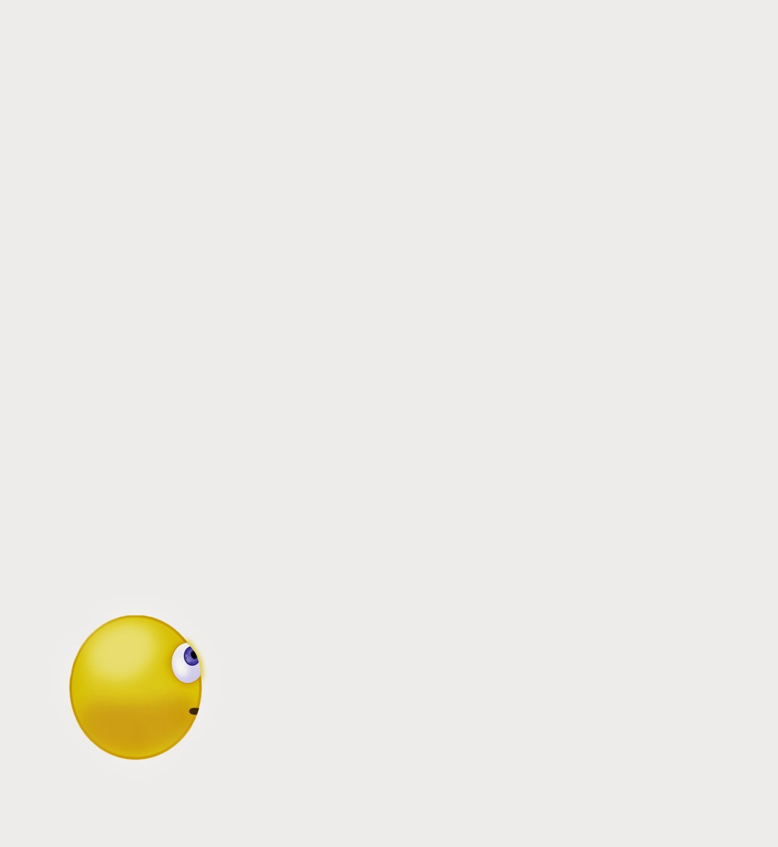
The Smileys used in the final animation were created by using the eclipse tool, with a thin but distinctive (2px) dark yellow outline, i attempted several different yellow gradients but in the end used a yellow fill. I used this background ball for each smiley, but layered each of them differently with further details.
I used the airbrush tool with a darker yellow for Smileys under belly and a light airbrushed white to highlight and define his 3d like curvature.
The eyes were difficult, i wanted them friendly and full of the relevant emotions.
Most of the smileys have the same eyes on slightly tweaked to show the different emotion or line of sight.
Basically most of them consist of an eclipse with the same dark yellow outline as the background eclipse and a faint light blue to white gradient, with small faint airbrushing to show gloss and curve details, the eclipse has a dark yellow drop shadow with a high curved contour. Above that there's another smaller eclipse with a dark blue outline and a light blue-blue radial gradient, with a very dark blue pupil and light blue 10px and 4px or 2px highlights, i originally wanted to airbrush these highlights like the background eclipse but it left the smileys eyes looking unnatural, faint and inconsistent with the cartoon like style of the rest of the website.
The mouths were extremely tricky to get right, especially the colour since black was too out of place yet yellow wasn't obvious enough, even with a drop shadow or darker outline, i'm not entirely pleased with the final yellow/brown colour but it seemed the most suitable in the end.
The smileys search and information boxes were created using a simple rounded box with a light blue gradient fill, however the accessories were made from the original designs except the thermometer in the Health icon smiley, it was an online jpeg that i added adjustments and a filter sponge filter to.
The book and its block colour was too simple so i added a light brown inner shadow to give it depth, and the bag of ice on the Health icon was given an adjusted plastic wrap filter to give it a more realistic texture, although i like the final look of the plastic bag with the filter, im certain most of the detailed ice inside the bag is lost through the filter.
Im extremely pleased with the final versions of Smiley and the smiley health and social icons.

neutral

hover
waiting

correction

search

snooze
I created the pages in chronological order, making the homepage first. The home page would be the first and last page in the animation so it was important however it would show low functionality and has a basic design.
I started the homepage by adding the already created smiley assets, aka. the large greeting smiley, health icon and social icon.
The large greeting smiley is the hover smiley tripled in size with a speach box which is primarily a curved box with a modified flick. to subtly highlight the smiley i gave it a thin faint blue, the same blue as the side panels.
The icon smileys would have a more dominant glow but it was more for the benefit of the icons functionality. ie white until selected, in that case it turns vibrant green.
Since i used green as a highlight indicator so early into the website, i continued to use green for selected buttons, this would keep consistency throughout the websites design and animation.
The text , icons and other assets were all positioned using the wireframe as a guide, this proved extremely useful many times throughout the digital assets creation.
The bottom three ad boxes would eventually be used up to the clients discretion but for my website design i filled them using stock images.
The three chosen images related to events especially in the community and a child helpline, indicating there would be helplines of many kinds available on this website, however a child wouldn't think to look further into a website than the first page for something they wanted, and i wanted the websites prototype to have the appearance of a dominant family friendly, safe environment for all ages.
The three images opacity was lowered to 55% so they wouldn't be too dominant and disrupt the designed asset hierarchy.
 |
| Homepage |
The symptoms navigator would be one of the screens with the highest amount of functionality shown in the final animation so i spent alot of time on it.
Although the buttons with popular suggestions stayed the same as the wireframe, i created two assets that show their functionality when hovered over with the cursor. this is the screen where i showed the first smiley and its functionality, ie neutral to hover.
I had difficulty choosing the right type size for the buttons was difficult as the text ranges from two words to two letter words.
There were many options and filters i wanted to add to this page, but as its the first view of the symptoms navigator i decided less would be more, so i kept it simple, six suggestion buttons, a gender filter, the symptoms navigator dummy silhouette and at the top the title. Other filters and indicators could and would appear after a selection, in this animations case however the user chooses to skip navigator and go straight to the manual search bars.
The title was transformed with an arch and a has a faint drop shadow, the title of the page is quite self explanatory for the pages function.
Like the Smiley icons, i was tempted to both use stock images or create the person in 3d max, however after finding some similar images to the desired blob man silhouette, i decided it would keep the theme and asset design consistent and create them myself with photoshop, using the colour, shape, pose from several reference images that together made the desired asset.
I wanted a genderless figure, but not creepy or intimidating, so hopefully this plush like smooth design is as simple and effective as intended.

creation of blob in photoshop
 |
| Symptoms Navigator |
After the user chooses to skip the navigation filter they are brought to the first manual search page, The search bars are simple in design and functionality, with faint search suggestions for straight forward prompts.
At the bottom of the screen there are popular searches, which include chest pains, stress/depression, family and baby health/vaccinations, and sexual health. These are the four of the biggest issues that the clients spoke about early in this project.
I changed the images to black and white so they would be equal and less intrusive to the user.
Although this website should be easy to use, obvious, and friendly, i have to remember there are limits since it could be used for sensitive topics, especially since the target demographic for the health check finder are normally unsociable or uninformed.
This page will briefly show two search boxes and a go buttons functionality.
 |
| First Search Page |
The results will appear on the second search page, here the user would be able to search again, or browse the search results.
Below the search bar is a plain map, designed to be linked to google maps, with icons indicating where each of the search results are located. I created the icons using an outline similar to the google maps version except i didn't include any extra details and kept the colour scheme consistent with the rest of the blue assets.
In the animation the user will hoover over the icon that interested them most and it glows a faint blue, the same faint blue will appear around the search result in the list below, this is how they decide which search result to choose.
The search results have the basic information like the name and opening hours with a short mission statement that details the type of establishment.
The age is designed to only show six results at a time, you can see which page you ar on by using the small page filter below the results, the faded page numbers indicate which page you are on or how many other pages of results there are.
I included hypothetical clinics that range in status and specialties, showing a wide range for the user to make the most informed decision possible.
 |
| Second Search Page |
Once a clinic or event has been chosen the user would be brought to an information page with all the relevant details and links.
There is a back to search results bar at the top, incase the browser brings the user back to the first search page, causing users to be confused and irritated.
The information is all straight to the point, the event or clinic owners would contribute their mission statements to this page, treating it like an advertisement.
Other than the basic information the page also has links to reviews incase the user isn't yet satisfied and even a report button for user safety. It also features promotional photos, and a save for later button that acts like a book mark.
The user has the choice to use the establishments contact details or book appointment now using the button at the bottom of the screen, positioned last and to the right, giving the user the impression of the next stage.
 |
| Information Page |
The information box has the basic information that the clinic requires to book the appointment, the most confusing feature would likely be the time and date of the appointment, however if you know the time or the date you are free, the second option will allow you to choose what date or time is available to accommodate your choice. The most unique functionality of this screen would be the smileys prompt at a mistake and warning highlight around the mistake.
I think the functionalities shown on this screen are especially important to have in the final animation as it shows what happens when somethings wrong or how helpful the Smiley is to different situations.
Once the appointment has been booked you're brought to the successfully booked page but initially theres the one and only pop up, i used them sparingly as most people don't like them and they can be quite intimidating, this was a simple option to add the apportionment to your personal calendar, this would've been done through a log in/ register and or sync to your phone/tablet/desktop calender.
Once the appointment has been booked and you've made you decision regarding the calender option, you are left with the thankyou page, The thankyou page is a form of confirmation to assure the user and finalize the search and book process. Here is a thoughtful confirmation and advice on what to do next, including a reminder to make a note of the time and date of the appointment.
I think the functionalities shown on this screen are especially important to have in the final animation as it shows what happens when somethings wrong or how helpful the Smiley is to different situations.
 |
| Book Appointment Page |
 |
| Calender Pop Up |
There are helpful after care and appointment preparation links available so the user doesn't feel cast out or unsatisfied, this should allow the user to feel secure with help and guidance throughout the process from start to finish.
In the animation the user then returns to the home page by using the banner button, showing its functionality as well as bringing the animation and GIF full circle.
 |
| Thankyou Page |
Before animating process i created a new invisionapp with the final designs to see what the final walk through would look like from a users point of view, im extremely happy with how this project is turning out so far.


0 comments:
Post a Comment